About the project
Overview
Sid's Farm had built a loyal base of customers who genuinely believed in what the brand stood for. But visit the website, and you wouldn't know it. The site looked like it hadn't been touched in years, hid some of its most compelling offerings completely, and was quietly leaving an enormous amount of revenue on the table.
Platform: Website (desktop and mobile)
Type: Full redesign
Focus: Conversion, discovery, trust
Brand: Sid's Farm, Hyderabad
How it started
One of the first questions asked during the discovery phase was simple: if someone who had never heard of Sid's Farm landed on the homepage, what would they think the brand was? What would they do next? The honest answer, at the time, was uncomfortable. The site communicated very little about why the brand was different, made it hard to find key features, and for anyone outside Hyderabad, gave zero indication that Sid's Farm could even serve anyone outside Hyderabad.
There was also a stranger problem hiding in plain sight. Sid's Farm was running farm visits. Real, immersive, deeply differentiated experiences where customers could walk through the manufacturing plant, watch milk being processed, see adulteration testing happen in real time, feed the cows, take a tractor ride, and walk through the plantation. People loved it. But the only way most of them found out about it was through an Instagram ad. There was no booking system. No dedicated page. To reserve a spot, you called a number and paid via UPI on the day. It was entirely word of mouth and paid reach, and it was staying invisible to everyone who went looking on the website.
The brand was doing extraordinary things behind the scenes. The website just wasn't telling anyone.
What needed to change
Five distinct problem areas came out of the discovery phase. Each one was a leaking bucket, and together they were costing the brand attention, trust, and revenue.
The look and feel were doing the brand a disservice.
Sid's Farm stood for purity, transparency, and a premium product. The website looked dated, low-budget, and inconsistent. The visual language was not doing justice to the quality of what was being sold. For a brand where trust is everything, this was a serious problem.
Products with pan-India potential were invisible
Ghee, cereals, and other products with a shelf life of six months or more could have been shipped across India. There was real demand. But the website gave no indication that this was possible. Anyone outside Hyderabad assumed Sid's Farm simply wasn't for them and left.
Farm visits had no digital home
The farm visit experience was genuinely one of the most differentiated things Sid's Farm offered. But it existed entirely offline. No booking page, no information on the website, no way to discover it unless you happened to see an ad. People who found the website and wanted to know more had nowhere to go.
The free milk sample offer was buried
Sid's Farm offered free milk samples as a conversion tool, but finding the option on the website required effort. It wasn't surfaced prominently. Many potential customers who might have converted after tasting the product never made it that far.
Quality reports were the brand's best argument
Daily lab test reports were one of the most compelling trust signals in the dairy category. The brand was testing every batch and publishing results. But the reports were hard to find, poorly presented, and not being used as the conversion tool they could have been.
The redesign, feature by feature
Rather than rethinking the website as a whole and hoping individual problems resolved themselves, each challenge was treated as its own design brief. Five features. Five outcomes. One cohesive product.
A brand new look and feel
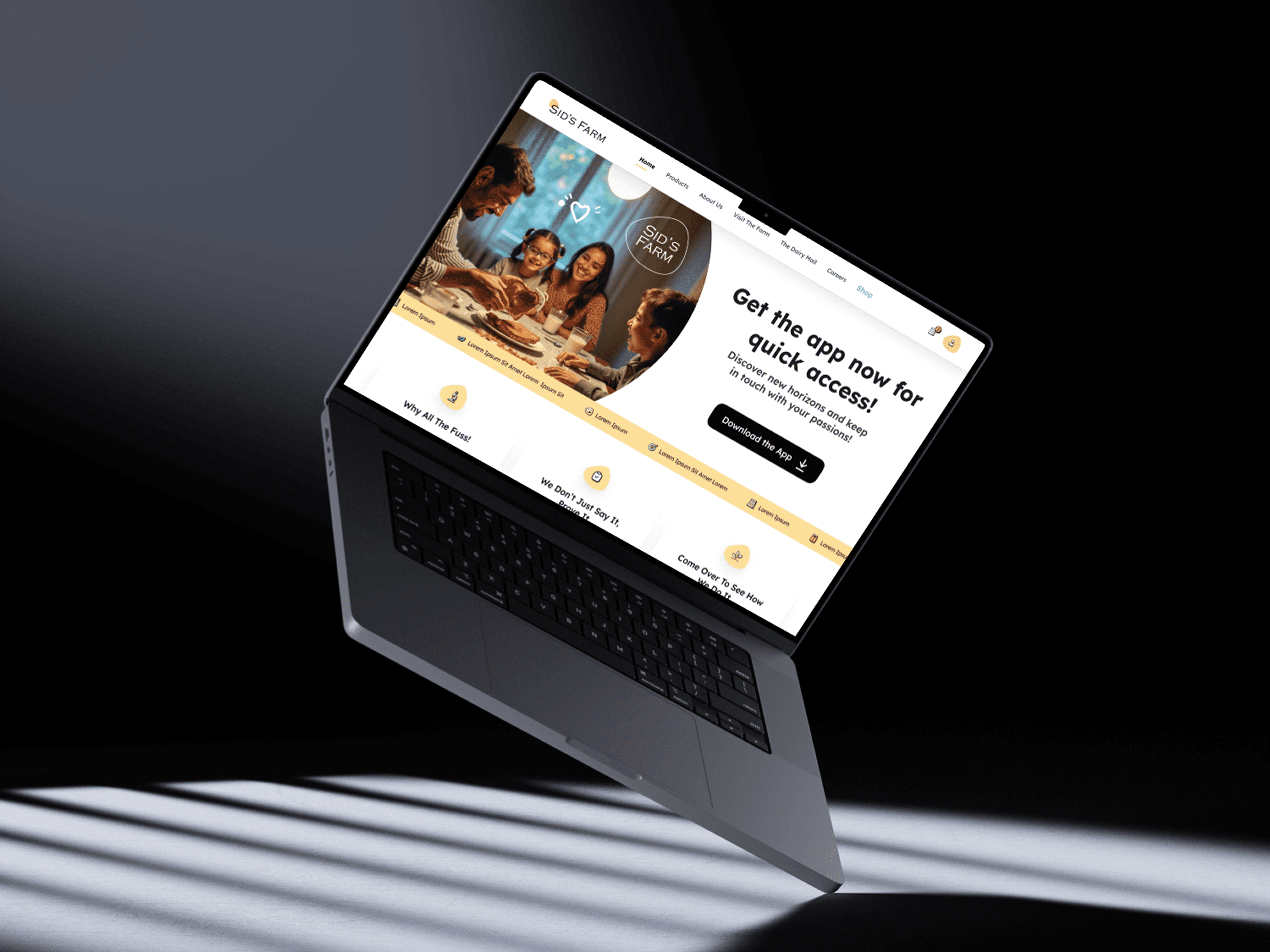
The redesign started with the visual language: a clean, warm, premium aesthetic that matched the quality of the product. Typography, colour, spacing, and layout were rebuilt from scratch to communicate trust and freshness before a single word was read.
Pan-India shipping for shelf stable products
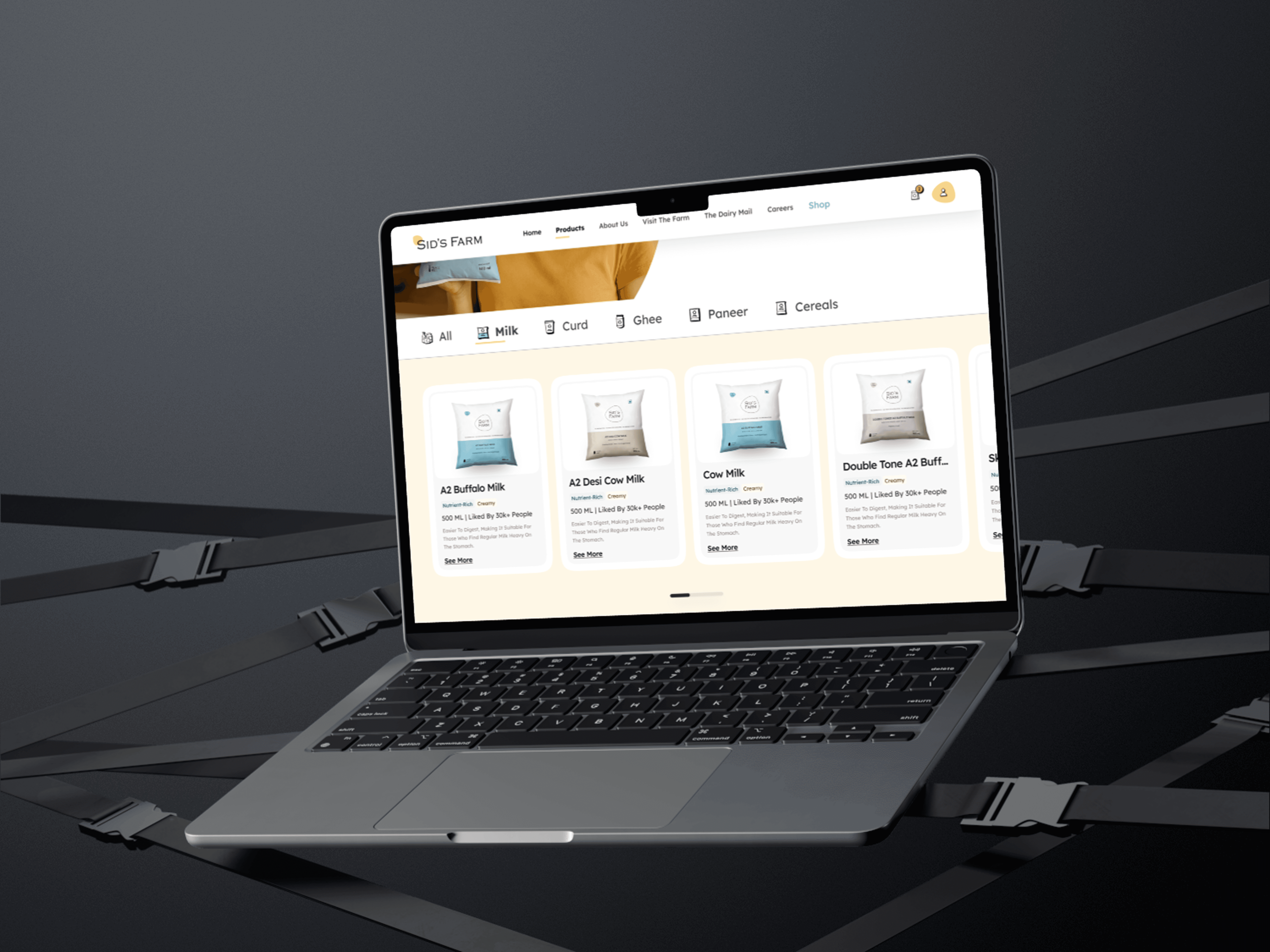
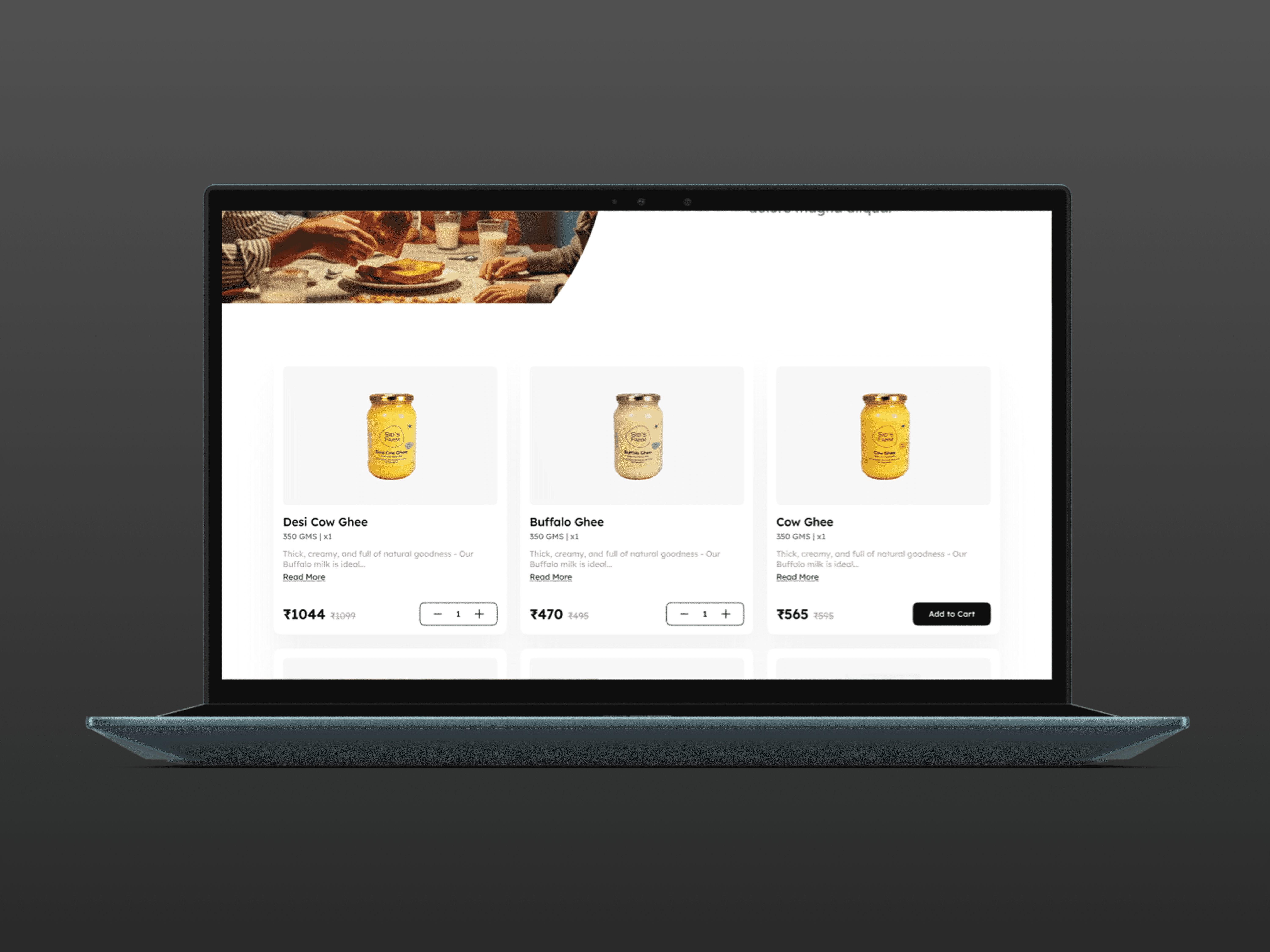
A dedicated section and product category was introduced for ghee, cereals, and other non-perishables with clear shipping communication. First time the website spoke to customers outside Hyderabad in a meaningful way.
Farm visit booking, built in
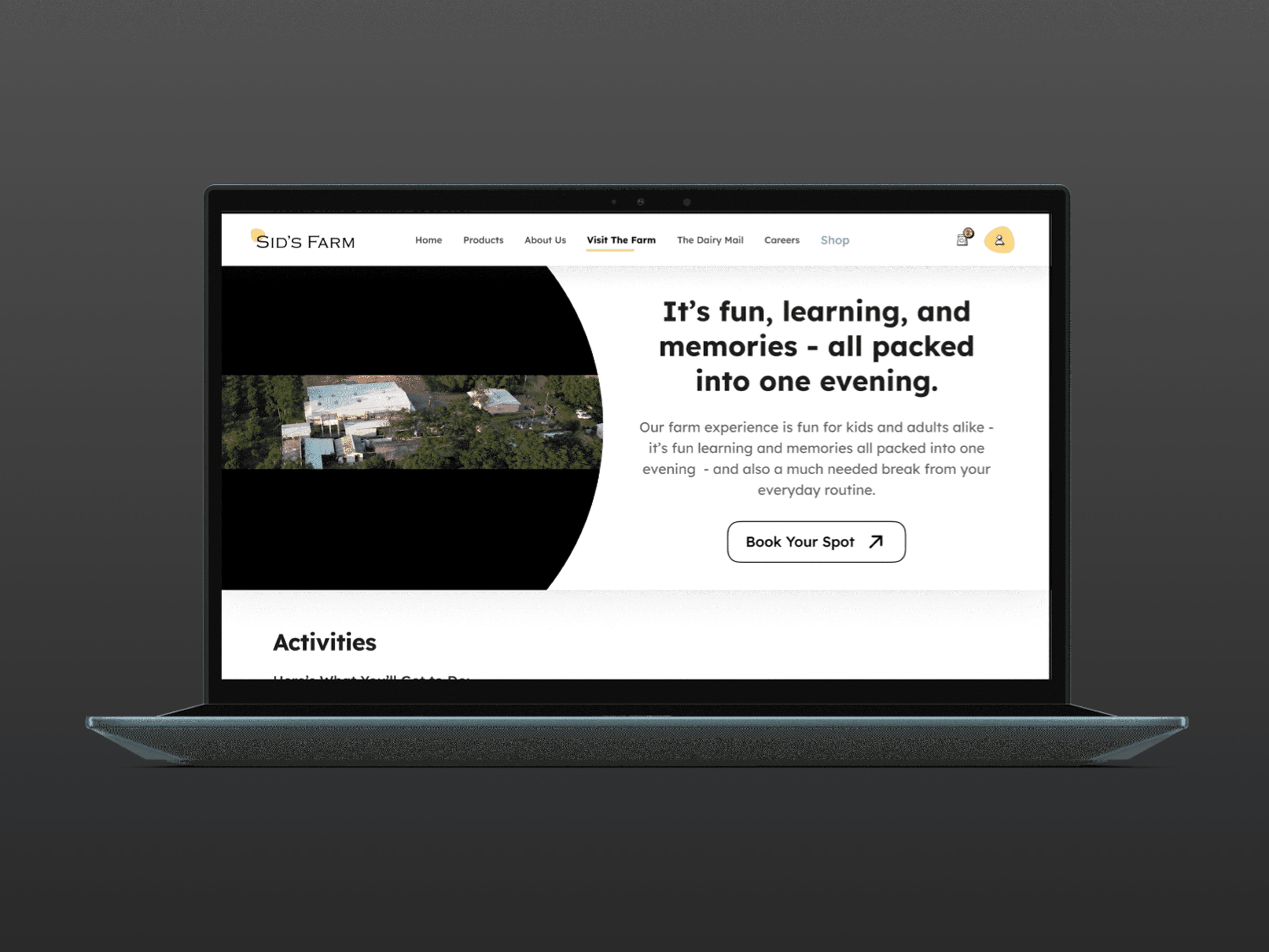
A full farm visit page was designed and built, covering what visitors experience, what to expect, how to reach the farm, and a simple seat booking flow. No more calling. No more UPI on the day. Customers could find, read about, and book a visit entirely on the website.
Free milk sample, surfaced prominently
The free sample CTA was moved to a high-visibility position on the homepage and product pages. The flow was simplified to two steps. What was previously a hidden feature became one of the highest-traffic flows on the site after launch.
Quality reports, made impossible to miss
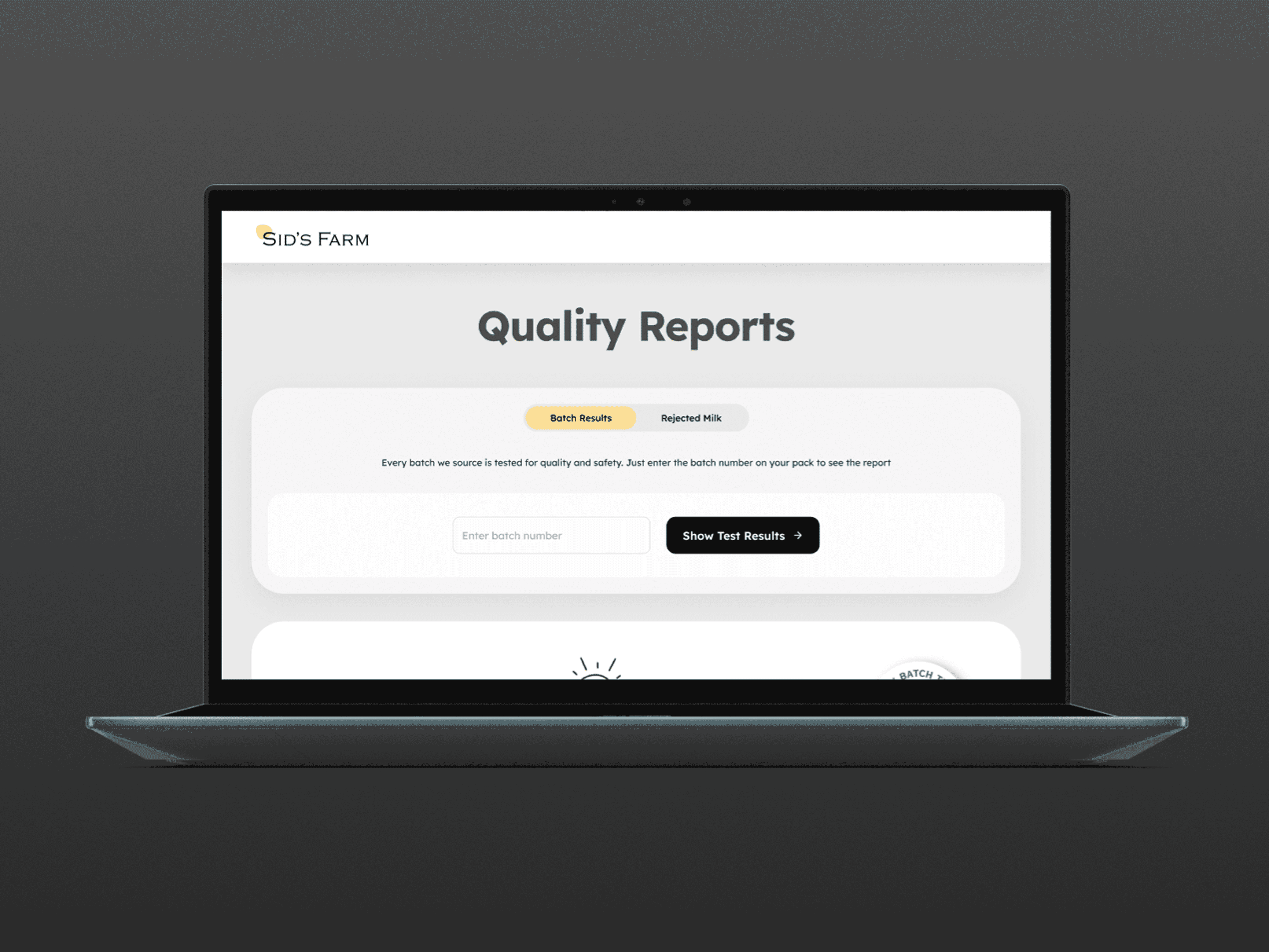
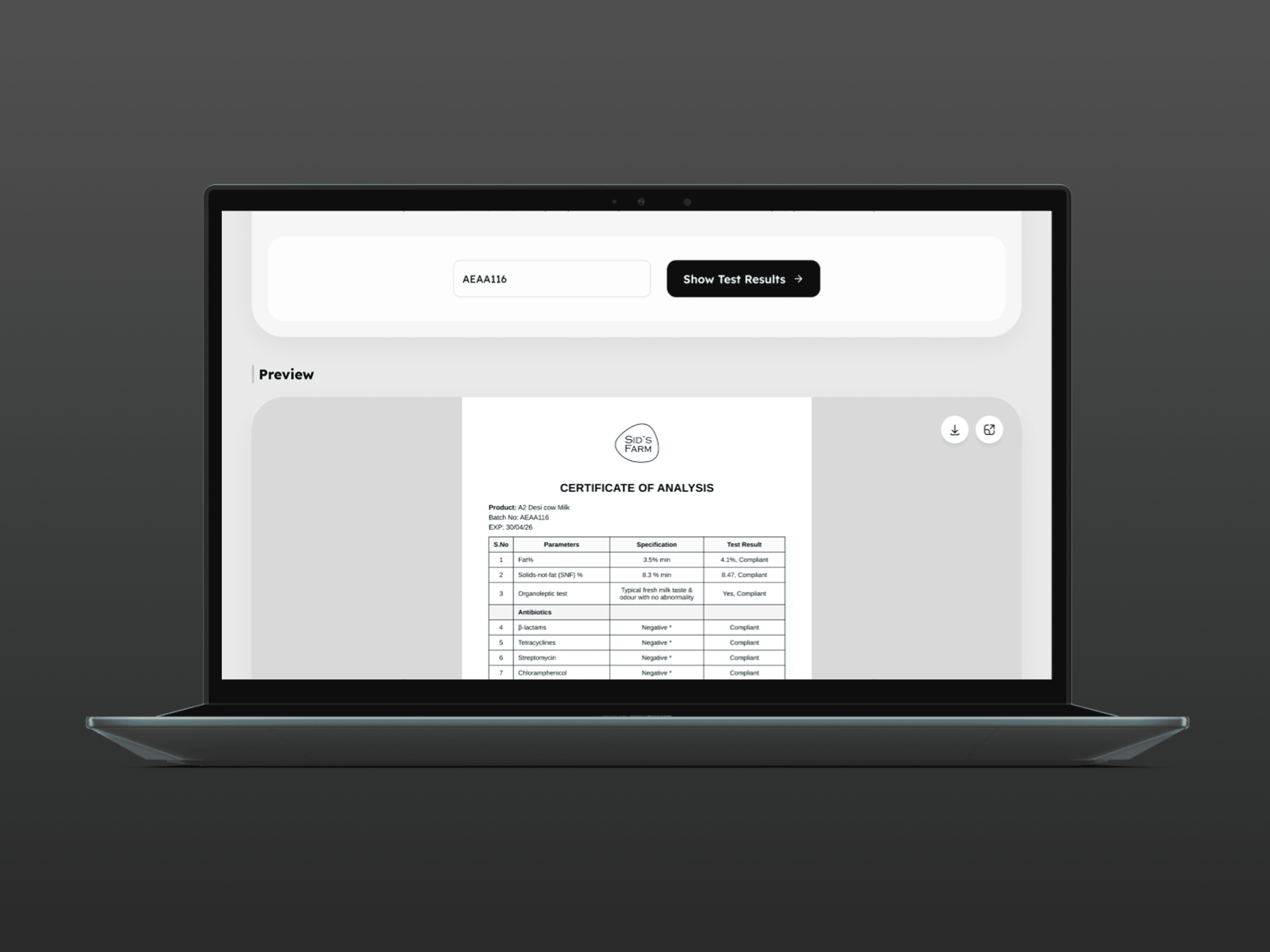
A dedicated quality page was designed with a clean, readable format showing daily batch results, what was tested, what was found, and what was rejected. The reports were also surfaced contextually on product pages, turning a buried compliance feature into a genuine conversion driver. Bounce rate on the quality page dropped significantly as visitors spent real time reading the data.
The farm visit feature, up close
This one deserves a longer look, because it was the most unusual design challenge in the project. The farm visit experience at Sid's Farm is genuinely remarkable. Visitors get to walk through the processing plant and watch milk being pasteurised and tested. They see the adulteration testing process happen in front of them. They watch packaging. They feed the cows, go on a tractor ride, and spend time on the plantation. It is experiential, transparent, and unlike anything most dairy brands offer.
But before the redesign, none of that was communicated digitally. If you typed "Sid's Farm farm visit" into a search engine, you got very little. The feature had no page, no copy, no images, no booking flow, and no organic discoverability at all. It existed only as a paid Instagram ad and a phone number. Every booking required manual coordination. Every visitor who found out about it and went to the website to learn more hit a dead end.
The new farm visit page was designed to do several things at once. It needed to explain what the experience actually was, because many people had no reference point. It needed to build excitement. It needed to answer practical questions about location, timing, age suitability, and what to bring. And then it needed to close the visit with an online booking flow that removed every barrier between interest and commitment.
The booking flow was kept deliberately short. Date selection, number of seats, and basic contact details. Confirmation sent instantly. Within two weeks of launch, the farm visit page was among the most visited pages on the site. Within the first quarter, more than 340 visits had been booked entirely online, with zero manual coordination required from the team.
Why quality reports matter more than most brands realise
In the dairy category, trust is the product. You can say your milk is pure. You can design beautiful packaging. But nothing does more for conversion than showing someone the actual lab data from today's batch. Sid's Farm was already doing this work. The tests were real. The results were being published. But on the old website, finding them required navigating to an obscure section, and the presentation was dry and hard to parse.
The redesigned quality page reframed the reports as a story of transparency. Each result was presented with context: what was being tested for, what an acceptable range looked like, and what happened to batches that didn't pass. The page was designed to be read, not just checked. It was surfaced from product pages as a secondary CTA so that anyone browsing a product could click straight through to the data behind it.
Post-launch, the quality page had the lowest bounce rate on the site and one of the highest average time-on-page figures. People were actually reading the reports. And the team started hearing from new subscribers who mentioned the quality page specifically as the reason they decided to try the product.
How the project came together
Discovery and audit
Full audit of the existing site, stakeholder interviews, and customer journey mapping. Five core problem areas identified. Success metrics agreed on for each.
Information architecture and wireframes
Site structure reworked from scratch. New pages mapped for farm visits, quality reports, and pan-India shipping. Wireframes tested with a small group of existing customers before visual design began.
Visual design
New design language developed: warm off-white backgrounds, deep greens, honest photography, and a type system that communicated premium without feeling cold. Every page designed at both desktop and mobile breakpoints.
Farm visit booking flow
Booking flow prototyped and tested separately. Edge cases like group bookings, sold-out dates, and rescheduling all handled within the design before handoff.
Launch and measurement
Phased rollout with analytics instrumented from day one. Three-month review with the team. Findings fed directly back into the mobile app redesign that followed.
What this project was really about
The Sid's Farm website redesign was not really a visual refresh project. It was a discovery and communication project. The brand had built genuinely differentiated things, from daily lab tests to immersive farm visits to pan-India capable products, and the website was simply not surfacing any of them. The design work was about closing the gap between what the brand had built and what a customer landing on the homepage could actually find.
The farm visit feature alone became a proof of concept for the whole project. Before the redesign, bookings required a phone call and a leap of faith. After the redesign, they happened at midnight on a Sunday when no one was in the office. That is what good design actually does. It removes the moments where trust breaks down and replaces them with moments where it builds.
Client
Sid's Farm
Stack
Figma
Timeline
4 Weeks
Year
2025
Visuals