About the project
Overview
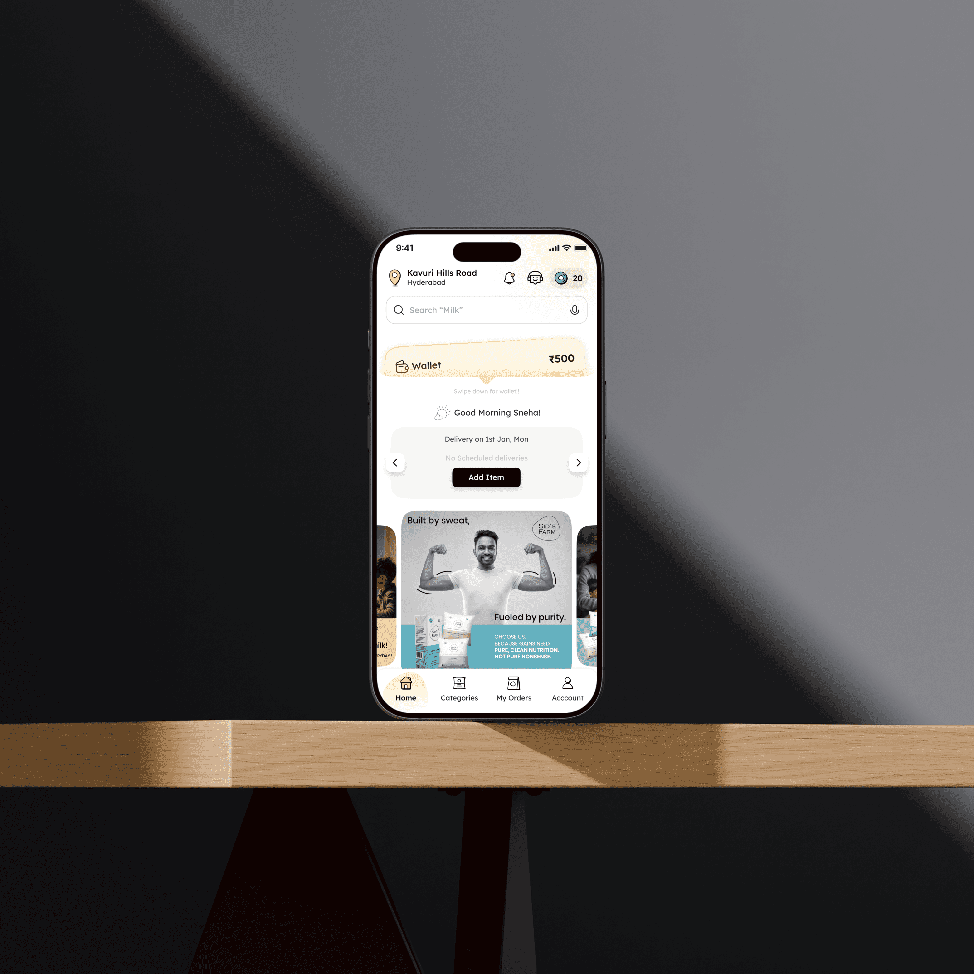
Sid's Farm is a Hyderabad-based farm-to-home dairy brand delivering fresh milk and dairy products on a daily subscription. While the product had strong organic traction, the mobile app experience was creating friction at every critical touchpoint
From first open to successful subscription activation.
This redesign focused on reducing time-to-subscribe, increasing session engagement, and enabling new revenue channels like autopay, all without increasing marketing spend.
"The goal wasn't to make it pretty. It was to make every tap count, and then remove as many taps as possible."
The challenge
New users were taking an average of 15 days to convert from download to active subscriber. Session time hovered around 1.4 minutes, suggesting users weren't exploring enough to build confidence. Address capture, which is critical for delivery logistics, was failing more than half the time.
The result: high acquisition cost, low activation rate.
Key friction points identified
Long time-to-subscribe: A multi-screen onboarding flow with an unclear value proposition delayed when users committed to a plan.
Address drop-off: Address entry appeared too early, before users understood the service, causing abandonment.
No autopay infrastructure: Every order required manual payment, creating churn risk and admin overhead for the business.
Same-day orders underutilised: The feature existed but was buried, missing an incremental revenue opportunity.
Results at a glance
Measured post-launch across the same user cohort size:
Days to subscribe−63%15.06 → 5.56 days
Session time+85%1.4 → 3.7 min
Addresses captured+123%3,935 → 8,781
Same-day orders+70%5.20% → 8.84%
Subscription items+12.5%7.55L → 8.50L
Autopay revenue (6 wks)₹18.5LNew — no baseline
Marketing spend reduced by 70–80% from baseline over the same period, meaning these gains came from product improvement, not paid acquisition.
Deep dive: key metrics
Days to subscribe
Before: 15.06days
After: 5.56days
Streamlining the subscription funnel, surfacing plan selection earlier, reducing confirmation steps, and adding contextual social proof cut decision time by nearly two-thirds. Users who might have churned in the consideration phase were converting within their first week.
Session time
Before: 1.4min
After: 3.7min
Longer sessions reflect stronger engagement, users exploring products, managing deliveries, and interacting with the subscription dashboard rather than dropping off at a confusing screen. An 85% increase in session duration signals that the redesigned information architecture was working.
Address captured
Before: 3,935
After: 8,781
More than doubling address capture (+123%) was one of the most operationally significant wins. By repositioning address entry to occur after users had already experienced value. Post-browse or mid-subscription, drop-off at this step was dramatically reduced.
Autopay revenue (new feature)
With no prior baseline, the redesign introduced an autopay flow that generated ₹18.5 lakh in its first six weeks. This wasn't a UX tweak; it was a net-new revenue channel unlocked through design.
Design decisions
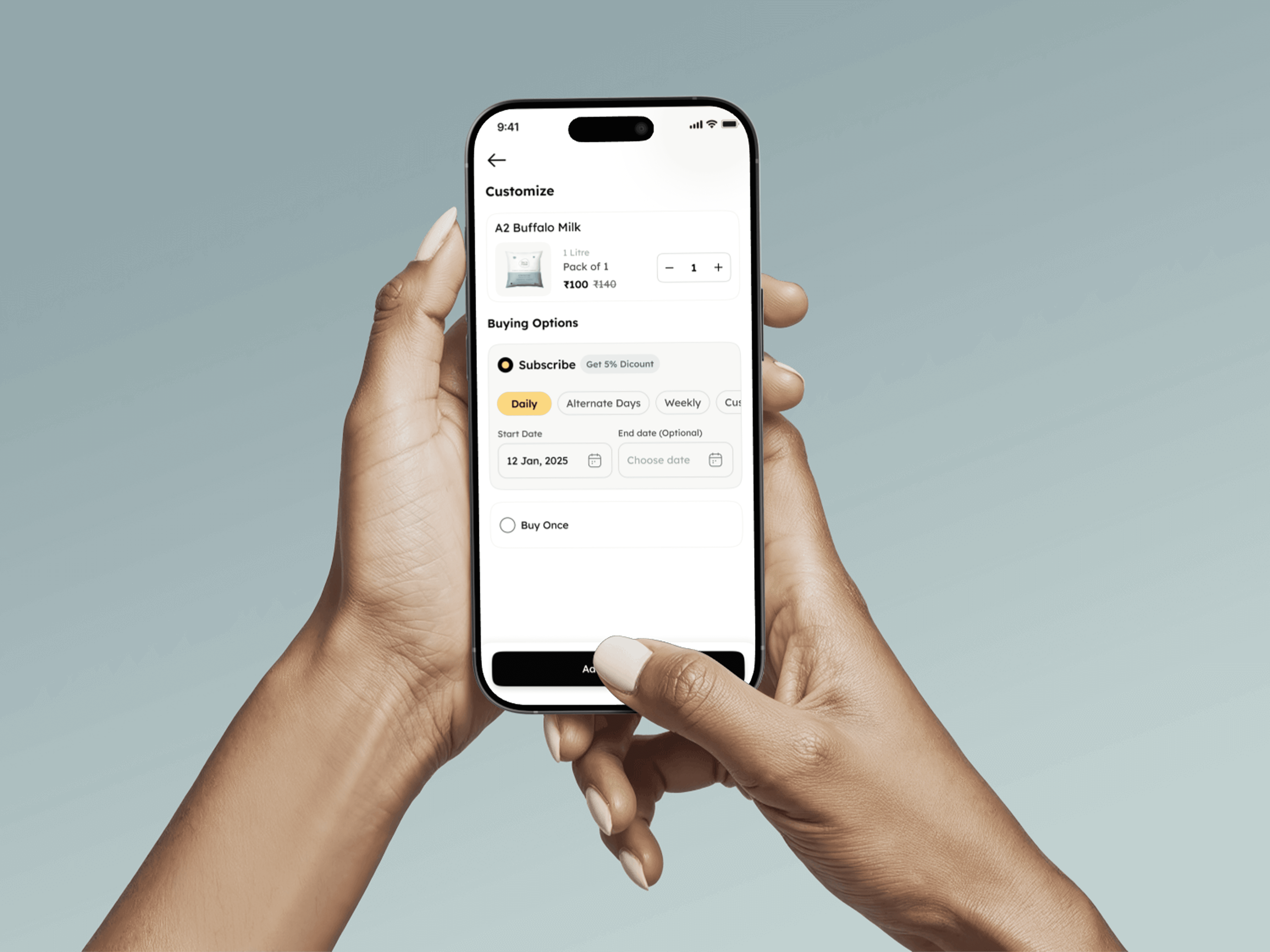
Funnel compression: Reduced onboarding from a multi-stage flow to a value-first experience, show the product, then ask for commitment.
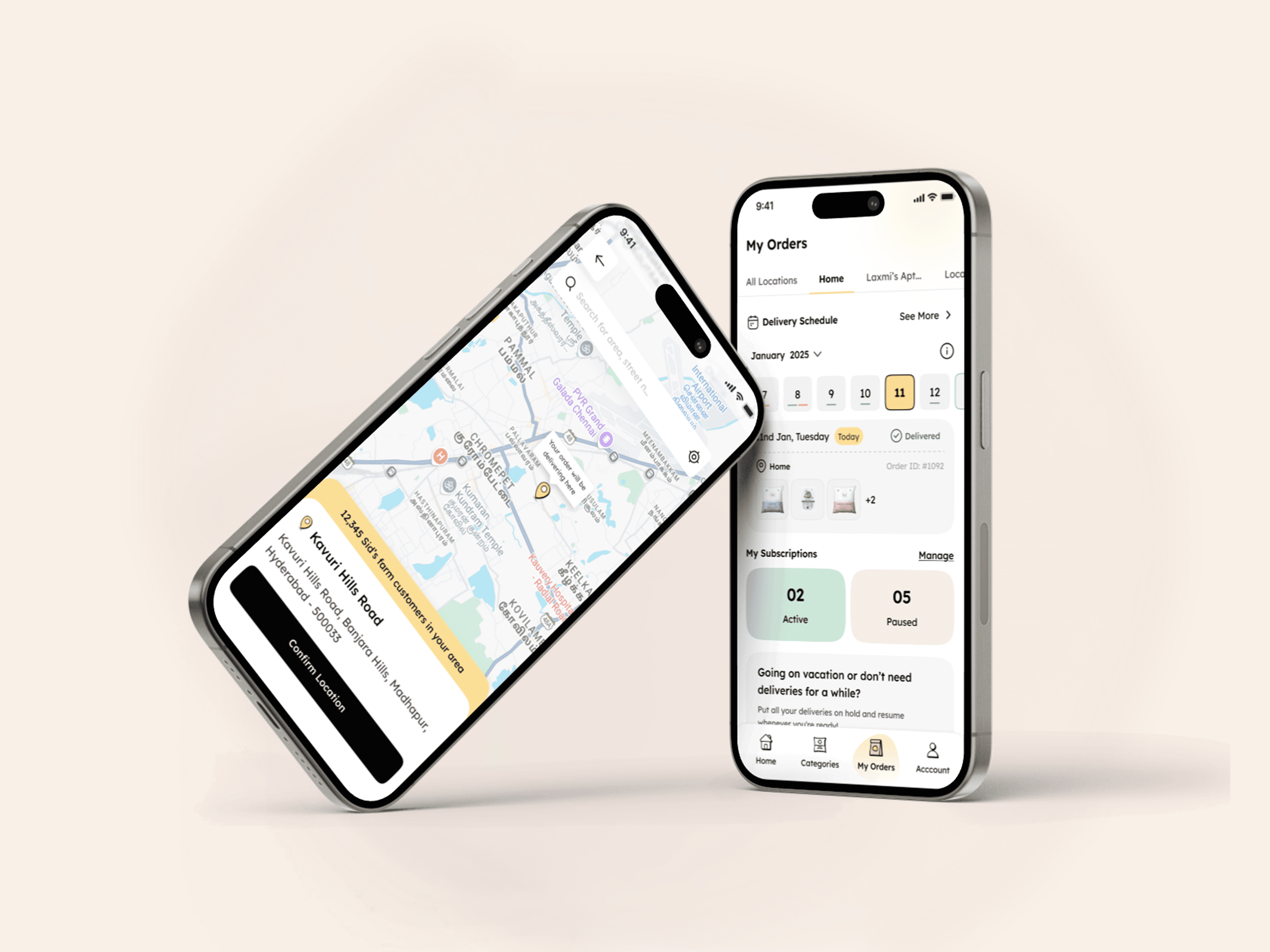
Progressive disclosure for address: Moved address capture downstream in the journey, after intent was established, dramatically reducing abandonment.
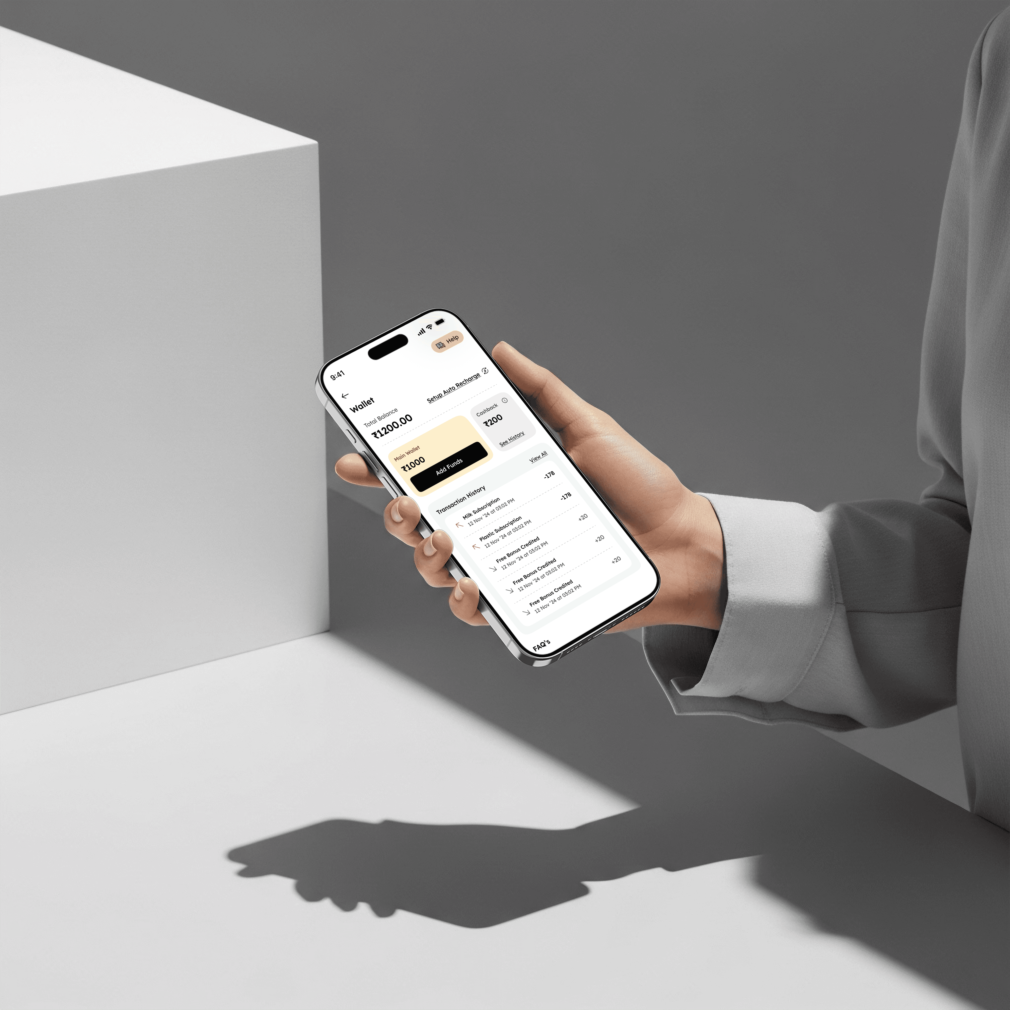
Autopay as a first-class feature: Designed autopay as a prominent, trust-building option with clear recurring billing transparency, not hidden in settings.
Same-day order prominence: Elevated the same-day order CTA from buried navigation to contextual placement on the home screen, lifting conversion by 70%.
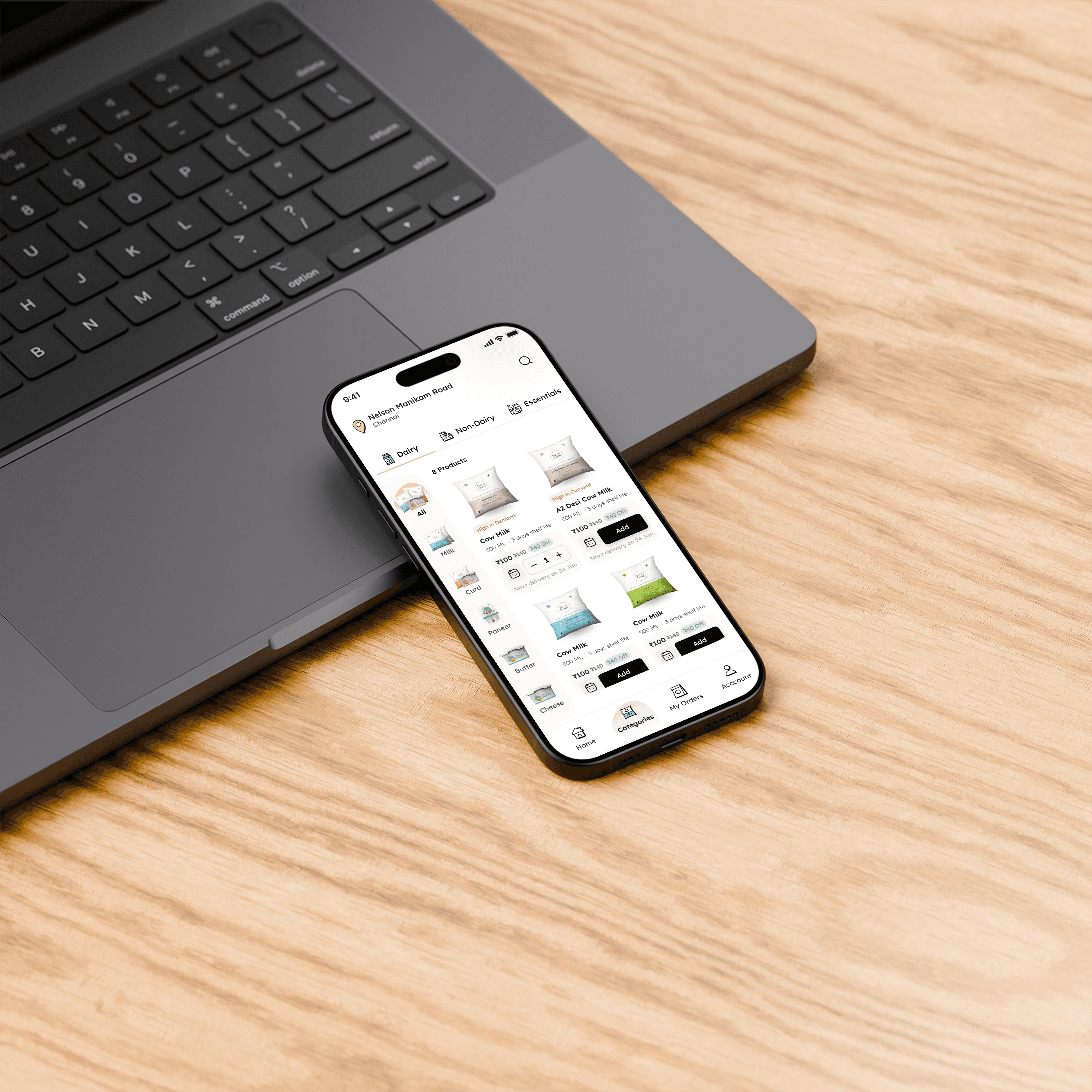
Subscription item upsell: Redesigned the product catalogue browsing to encourage bundle discovery, contributing to a 12.5% lift in items per subscription.
Business impact summary
The redesign achieved what most product investments aim for but rarely deliver simultaneously: faster conversion, deeper engagement, operational efficiency (via address capture), and entirely new revenue streams, all while reducing marketing spend by 70–80%.
₹18.5L in autopay revenue in 6 weeks. 8,781 addresses captured. 63% faster to subscribe. All with a fraction of the prior marketing budget.
Client
Sid's Farm
Stack
Figma React
Timeline
8 Months
Year
2025
Visuals